 Go Back to Home

 Rui Vergani Neto
 9, June, 2024
 13 min read
“The only way to do great work is to love what you do. If you haven’t found it yet, keep looking. Don’t settle. As with all matters of the heart, you’ll know when you find it.”
Steve Jobs
The project DT Money is a financial management application designed to help users track their expenses, manage budgets, and gain insights into their financial health. Leveraging the power of ReactJS and TypeScript, DT Money provides a seamless, efficient, and high-performance user experience.
In the first part of this tutorial, I will focus on creating all the visual elements. In the second part, I will implement the logic using REST API features to complete the project.
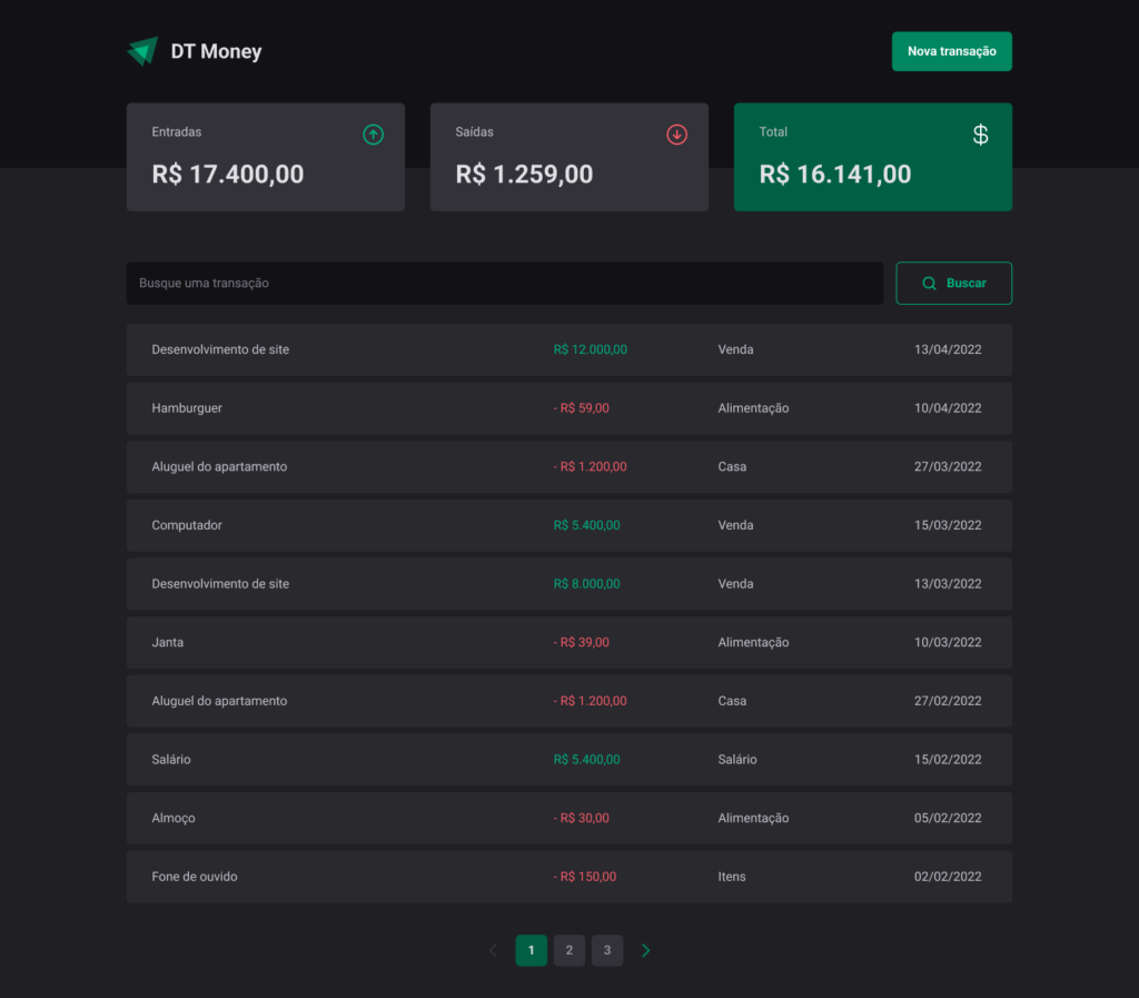
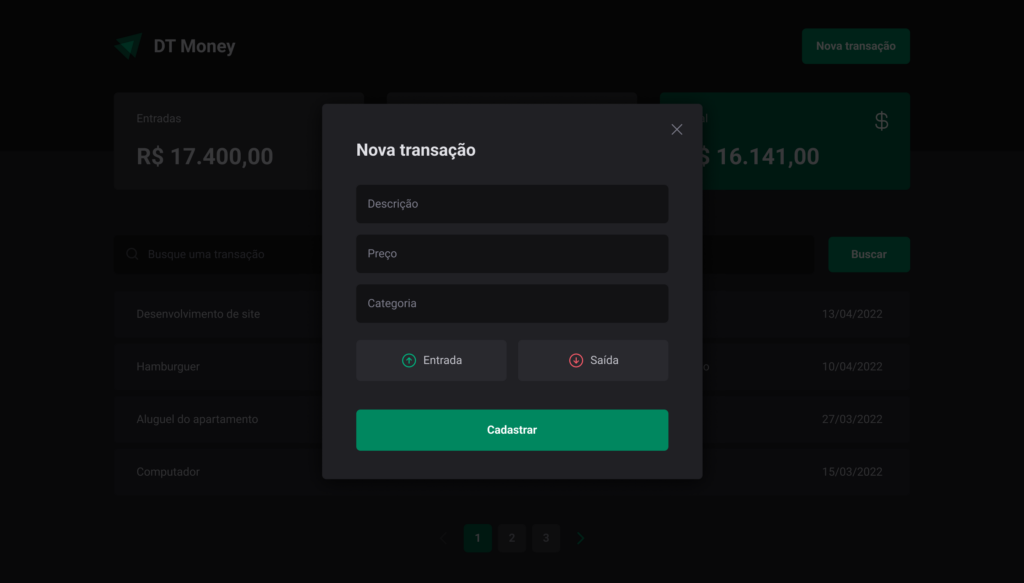
The finance web application will look like the pictures below:
Home Page:
Dialog Transactions Page:
In this project, we will be using Vite as the build tool. Follow these steps to set up your project
1. Open your terminal (this example uses a MacBook Pro and Visual Studio Code).
2. Run the following command to create a new Vite project. Choose React and TypeScript when prompted:
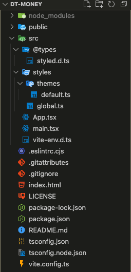
npm create vite@latest3. After the project has been created, you will need to delete some unnecessary files to clean up your folder structure. By the end of this step, your project folder should look like this:
To configure the CSS of the application, we will use Styled-Components. Additionally, we need the type definitions for TypeScript. Install them using the following commands:
npm i styled-components

npm i @types/styled-components -DNext, create the following folders and files inside the /src directory:
src/
├── styles/
│   ├── themes/
│   │   └── default.ts
│   ├── global.ts
└── @types/
    └── styled.d.ts
Now, let’s define the theme colors for the project. Below is the content for the file src/styles/themes/default.ts:
export const defaultTheme = {
  white: '#fff',
  'gray-100': '#E1E1E6',
  'gray-300': '#C4C4CC',
  'gray-400': '#8D8D99',
  'gray-500': '#7C7C8A',
  'gray-600': '#323238',
  'gray-700': '#29292E',
  'gray-800': '#202024',
  'gray-900': '#121214',
  'green-300': '#00B37E',
  'green-500': '#00875F',
  'green-700': '#015F43',
  'red-300': '#F75A68',
  'red-500': '#AB222E',
  'red-700': '#7A1921',
} as const // helps show the #000 as string when searching (Control + Space) for each color
Note: as const ensures that the theme colors show the HEX values in VSCode, facilitating debugging and improving development efficiency, we can use the as const assertion in TypeScript. This makes the color values read-only and more accurately typed.
When using styled-components in a TypeScript project, it’s crucial to define your own type definitions (@types) because styled-components do not provide these by default. Without these definitions, you won’t get proper type checking or IntelliSense for your theme properties, which can hinder your development experience.
Add the TypeScript definitions for Styled-Components in the file src/@types/styled.d.ts:
import { defaultTheme } from './../styles/themes/default';
import 'styled-components';

type ThemeType = typeof defaultTheme

declare module 'styled-components' {
  export interface DefaultTheme extends ThemeType {}
}
In the GlobalStyle component, we will define all the global CSS configurations that the project will have. Create your global styles in src/styles/global.ts:
import { createGlobalStyle } from "styled-components";

export const GlobalStyle = createGlobalStyle`
  *{
    margin: 0;
    padding: 0;
    box-sizing: border-box;
    outline: none;
    text-decoration: none;
    list-style: none;
    border: none;
  }
  html{
    overflow-x: hidden;
    scroll-behavior: smooth;
  }
  body{
    -webkit-font-smoothing: antialiased;
    background-color: ${props => props.theme['gray-800']};
    color: ${props => props.theme['gray-100']};
  }
  :focus{
    outline: 0;
    box-shadow: 0 0 0 2px ${props => props.theme['green-500']};
  }
  body, input, textarea, button{
    font: 400 1rem Roboto, sans-serif; // weight - size - family
  }
`;To apply the theme and global styles throughout your application, you need to use the ThemeProvider component from styled-components and include the GlobalStyle component inside your App.tsx.
Here’s how to do it:
ThemeProvider: This allows you to provide the theme to all styled-components in your application.GlobalStyle: This ensures that the global styles are applied across your entire application.Here’s how your App.tsx file should look:
import { ThemeProvider } from "styled-components";
import { defaultTheme } from "./styles/themes/default";
import { GlobalStyle } from "./styles/global";

export function App() {
  return (
    <ThemeProvider theme={defaultTheme}>
      <GlobalStyle />
      <h1>Hello World</h1>
    </ThemeProvider>
  )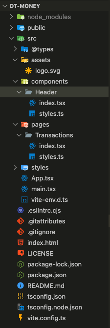
}To organize your project effectively, create a few new files and directories for assets, the header component, and pages. Here’s how your folder structure should look:
Here is the implementation of the Header component using the HTML structure and Styled-Components CSS code.
src/components/Header/index.tsx
import { HeaderContainer, HeaderContent, NewTransactionButton } from "./styles";

// Images
import LogoImage from '../../assets/logo.svg';

export default function Header() {
  return (
    <HeaderContainer>
      <HeaderContent>
        <img src={LogoImage} alt="" />
        <NewTransactionButton>
          New Transaction
        </NewTransactionButton>
      </HeaderContent>
    </HeaderContainer>
  )
}
src/components/Header/Header.styles.ts
import styled from "styled-components";

export const HeaderContainer = styled.header`
  background: ${props => props.theme['gray-900']};
  padding: 2.5rem 0 7.5rem;
`;

export const HeaderContent = styled.div`
  width: 100%;
  max-width: 1120px;
  margin: 0 auto;
  padding: 0 1.5rem;

  display: flex;
  justify-content: space-between;
  align-items: center;
`;

export const NewTransactionButton = styled.button`
  display: flex;
  justify-content: center;
  align-items: center;
  gap: 10px;
  height: 50px;
  border: 0;
  background: ${props => props.theme['green-500']};
  color: ${props => props.theme.white};
  font-weight: bold;
  padding: 0 1.25rem;
  border-radius: 6px;
  cursor: pointer;
  transition: background-color 0.2s;

  &:hover{
    background: ${props => props.theme['green-700']};
  }
`;
With these changes, you have:
Transactions component and included the Header component within it.App.tsx to include the Transactions component in the application’s routing.This setup ensures that the Header is displayed across all major pages of your application, and the project is well-structured and ready for further development.
To add the Summary Cards component to your project, create a new directory called Summary containing index.tsx and styles.ts files.
Update your folder structure to include the new Summary component:
src/
├── components/
│   ├── Header/
│   │   ├── Header.tsx
│   │   └── Header.styles.ts
│   └── Summary/
│       ├── index.tsx
│       └── styles.ts
import { SummaryCard, SummaryContainer } from "./style";
import { ArrowCircleDown, ArrowCircleUp, CurrencyDollar } from "phosphor-react";

export function Summary() {
  return (
    <SummaryContainer>
      <SummaryCard>
        <header>
          <span>Money In</span>
          <ArrowCircleUp size={32} color="#00b37e" />
        </header>
        <strong>R$ 17.400,00</strong>
      </SummaryCard>
      <SummaryCard>
        <header>
          <span>Money Out</span>
          <ArrowCircleDown size={32} color="#f75a68" />
        </header>
        <strong>R$ 1.259,00</strong>
      </SummaryCard>
      <SummaryCard variant="green">
        <header>
          <span>Total</span>
          <CurrencyDollar size={32} color="#fff"/>
        </header>
        <strong>R$ 16.141,00</strong>
      </SummaryCard>
    </SummaryContainer>
  )
}
Inside the style.ts you can add the following code:
Note: something very nice in this section is the ability to add the interface to create a variant variable for the cards. The last card has a green background and by creating an interface and adding an optional variant you can configure a new CSS rule for this variable.
The code below shows how you can access the props inside a styled-component component.
${props => props.variant === 'green' && css`
    background-color: ${props.theme['green-700']};
`}
In this updated styles.ts file:
SummaryCardProps to define the possible variants for the summary card.SummaryCard styled component, I used the variant prop to conditionally apply styling for the highlight variant. If the variant prop is set to 'green', it will apply a green background color and white text color to the card.import styled, { css } from "styled-components";
export const SummaryContainer = styled.section`
width: 100%;
max-width: 1120px;
margin: 0 auto;
padding: 0 1.5rem;
display: grid;
grid-template-columns: 1fr 1fr 1fr;
gap: 2rem;
margin-top: -5rem;
z-index: 2;
`;
// Using interface to create a variant variable for the cards
interface SummaryCardProps {
variant?: 'green';
}
export const SummaryCard = styled.div<SummaryCardProps>`
width: 100%;
max-width: 352px;
padding: 24px 24px 24px 32px;
background: ${props => props.theme['gray-600']};
border-radius: 6px;
display: flex;
flex-direction: column;
align-items: flex-start;
gap: 12px;
header{
width: 100%;
display: flex;
align-items: center;
justify-content: space-between;
span{
color: ${props => props.theme['gray-300']};
font-size: 16px;
font-weight: 400;
line-height: 160%; /* 25.6px */
}
}
strong{
color: ${props => props.theme['gray-100']};
font-size: 32px;
font-weight: 700;
line-height: 140%;
}
${props => props.variant === 'green' && css`
background-color: ${props.theme['green-700']};
`}
`;In this component I have created the table that will display all transactions, the most challenging part is to create the price props to change colors from green to red depending on income or outcome of the money, the rest is simple HTML and CSS code.
Here is the implementation of the Table of Transactions component using the HTML structure and Styled-Components CSS code.
src/pages/Transactions/index.tsx
import Header from "../../components/Header";
import { Summary } from "../../components/Summary";
import { PriceHighlight, TransactionsContainer, TransactionsTable } from "./styles";

export function Transactions() {
  return (
    <div>
      <Header />
      <Summary />
      {/* Header Table */}
      <TransactionsContainer>
        <TransactionsTable>
          <tbody>
            <tr>
              <td width="50%">Desenvolvimento de site</td>
              <td>
                <PriceHighlight variant="income">
                  R$ 12.000,00
                </PriceHighlight>
              </td>
              <td>Venda</td>
              <td>13/04/2022</td>
            </tr>
            <tr>
              <td width="50%">Aluguel do apartamento</td>
              <td>
                <PriceHighlight variant="outcome">
                  -R$ 1.000,00
                </PriceHighlight>
              </td>
              <td>Venda</td>
              <td>13/04/2022</td>
            </tr>
            <tr>
              <td width="50%">Hamburguer</td>
              <td>
                <PriceHighlight variant="income">
                  R$ 12.000,00
                </PriceHighlight>
              </td>
              <td>Venda</td>
              <td>13/04/2022</td>
            </tr>
            <tr>
              <td width="50%">Computador</td>
              <td>
                <PriceHighlight variant="outcome">
                  -R$ 1.000,00
                </PriceHighlight>
              </td>
              <td>Venda</td>
              <td>13/04/2022</td>
            </tr>
          </tbody>
        </TransactionsTable>
      </TransactionsContainer>
    </div>
  )
}
Now find below the src/pages/Transactions/styles.ts for the file above:
import { styled } from 'styled-components';

export const TransactionsContainer = styled.main`
  width: 100%;
  max-width: 1120px;
  margin: 4rem auto 0;
  padding: 0 1.5rem;
`;

export const TransactionsTable = styled.table`
  width: 100%;
  border-collapse: separate; // separate between td
  border-spacing: 0 0.5rem;
  margin-top: 1.5rem;

  td{
    padding: 1.25rem 2rem;
    background: ${props => props.theme['gray-700']};

    &:first-child{
      border-top-left-radius: 6px;
      border-bottom-left-radius: 6px;
    }
    &:last-child{
      border-top-right-radius: 6px;
      border-bottom-right-radius: 6px;
    }

  }
`;

interface PriceHighlightProps {
  variant: 'income' | 'outcome';
}

export const PriceHighlight = styled.span<PriceHighlightProps>`
  color: ${props => props.variant === 'income' ? props.theme['green-300'] : props.theme["red-300"]};

`;
Note: the interface requires a mandatory variant variable, which will be assigned the color green if it represents ‘income’ or red if it signifies ‘outcome’.
To incorporate the Search Form component into your project, follow these steps:
1. Create Directory: Begin by establishing a new directory named “SearchForm” within the “Transactions/components” folder.
2. Files Creation: Within the newly created “SearchForm” directory, add two files: “index.tsx” and “styles.ts”. These files will contain the TypeScript and styling code for the Search Form component, respectively.
3. Update Folder Structure: Modify your folder structure to reflect the addition of the new Search Form component.
Folder Structure
Update your folder structure to include the new Search Form component:
src/
├── pages/
│   ├── Transactions/
│       ├── index.tsx
│       └── styles.ts
│       └── components/
│            └── SearchForm/
│                  ├── index.tsx
│                  └── styles.ts
Here is the implementation of the Seach Form component using the HTML structure and Styled-Components CSS code.
src/pages/Transactions/components/SearchForm/index.tsx
import { MagnifyingGlass } from "phosphor-react";
import { SearchFormContainer } from "./styles";

export function SearchForm() {
  return (
    <SearchFormContainer>
      <input type="text" placeholder="Search for a transaction" />
      <button>
        <MagnifyingGlass size={20} />
        Search
      </button>
    </SearchFormContainer>
  )
}
src/pages/Transactions/components/SearchForm/style.ts
import { styled } from 'styled-components';

export const SearchFormContainer = styled.form`
  display: flex;
  gap: 1rem;
  input{
    flex: 1;
    border-radius: 6px;
    border: 0;
    background-color: ${props => props.theme['gray-900']};
    color: ${props => props.theme['gray-300']};
    padding: 13px 20px;
    &::placeholder{
      color: ${props => props.theme['gray-500']};
    }
  }
  button{
    display: flex;
    align-items: center;
    gap: 0.7rem;
    padding: 13px 32px;
    border-radius: 6px;
    border: 1px solid ${props => props.theme['green-300']};
    background-color: transparent;
    font-weight: 700;
    line-height: 160%; /* 25.6px */
    color: ${props => props.theme['green-300']};
    cursor: pointer;
    transition: all .2s;

    &:hover{
      color: ${props => props.theme.white};
      border-color: ${props => props.theme['green-500']};
      background-color: ${props => props.theme['green-500']};
    }
  }
`;This step in our web application is crucial as it emphasizes accessibility considerations. Here are several websites where we can verify accessibility rules:
When developing a modal or dialog component, adherence to specific rules is essential to ensure proper display on the screen and compliance with accessibility standards. In this context, we’ll utilize Radix, a library optimized for swift development, easy maintenance, and accessibility.
Go to the Radix website, type dialog, and follow the installation steps below:
npm install @radix-ui/react-dialogThere are a few steps that are needed to create this component. The first step is to set up the HTML structure and understand how each component works. Find the code below and the explanation for the Dialog.
Anatomy
Import all parts and piece them together.

<Dialog.Root> = contains all parts of the dialog

<Dialog.Trigger asChild> =  the button that opens the dialog (asChild avoids creating another button and using the component above)

<Dialog.Portal> = When used, portals your overlay and content parts into the body. Portals in React lets you render some children into a different part of the DOM

<Dialog.Overlay> = A layer that covers the inert portion of the view when the dialog is open.

<Dialog.Content> = Contains content to be rendered in the open dialog.

<Dialog.Title> = An accessible title to be announced when the dialog is opened.

<Dialog.Close> = The button that closes the dialog.
Here is the implementation of the Dialog Component in the Header component using the HTML structure and Styled-Components CSS code.
src/components/Header/index.tsx
import { HeaderContainer, HeaderContent, NewTransactionButton } from "./styles";
import * as Dialog from '@radix-ui/react-dialog';

// Images
import LogoImage from '../../assets/logo.svg';

export default function Header() {
  return (
    <HeaderContainer>
      <HeaderContent>
        <img src={LogoImage} alt="" />

        <Dialog.Root>
          <Dialog.Trigger asChild>
            <NewTransactionButton>
              New Transaction
            </NewTransactionButton>
          </Dialog.Trigger>
          <Dialog.Portal>
            <Dialog.Overlay />
            <Dialog.Content>
              <Dialog.Title>New Transaction</Dialog.Title>
              <Dialog.Close></Dialog.Close>

            </Dialog.Content>
          </Dialog.Portal>
        </Dialog.Root>

      </HeaderContent>
    </HeaderContainer>
  )
}
src/components/Header/styles.ts
import styled from "styled-components";

export const HeaderContainer = styled.header`
  background: ${props => props.theme['gray-900']};
  padding: 2.5rem 0 7.5rem;
`;

export const HeaderContent = styled.div`
  width: 100%;
  max-width: 1120px;
  margin: 0 auto;
  padding: 0 1.5rem;
  display: flex;
  justify-content: space-between;
  align-items: center;
`;

export const NewTransactionButton = styled.button`
  display: flex;
  justify-content: center;
  align-items: center;
  gap: 10px;
  height: 50px;
  border: 0;
  background: ${props => props.theme['green-500']};
  color: ${props => props.theme.white};
  font-weight: bold;
  padding: 0 1.25rem;
  border-radius: 6px;
  cursor: pointer;
  transition: background-color 0.2s;
  &:hover{
    background: ${props => props.theme['green-700']};
  }
`;In this section, we will be adding a new component called NewTransactionModal inside the components folder and to make that work we will modify the Dialog Component in the Header component by creating a new component called NewTransactionModal and calling it here in the Header.
Here’s the code for the updated Header Component:
src/components/Header/index.tsx
import { HeaderContainer, HeaderContent, NewTransactionButton } from "./styles";
import * as Dialog from '@radix-ui/react-dialog';

// Images
import LogoImage from '../../assets/logo.svg';
import NewTransactionModal from "../NewTransactionModal";

export default function Header() {
  return (
    <HeaderContainer>
      <HeaderContent>
        <img src={LogoImage} alt="" />

        <Dialog.Root>
          <Dialog.Trigger asChild>
            <NewTransactionButton>
              New Transaction
            </NewTransactionButton>
          </Dialog.Trigger>
          <NewTransactionModal/>
        </Dialog.Root>

      </HeaderContent>
    </HeaderContainer>
  )
}
Next, create a new directory named "NewTransactionModal" inside the “components” directory. In this file, we’ve implemented the UI library Radix, utilizing the Dialog component. Additionally, we’ve integrated the phosphor-react library for the close icon.
src/components/NewTransactionModal/index.tsx
import * as Dialog from '@radix-ui/react-dialog';
import { CloseButton, Content, Overlay } from './styles';
import { X } from 'phosphor-react';

export default function NewTransactionModal() {
  return (
    <Dialog.Portal>
      <Overlay/>
      <Content>
        <Dialog.Title>New Transaction</Dialog.Title>
        <CloseButton>
          <X size={24}/>
        </CloseButton>

        <form action="">
          <input type="text" placeholder='Description' required/>
          <input type="number" placeholder='Price' />
          <input type="text" placeholder='Category' />
          <button type='submit'>
            Register
          </button>
        </form>

      </Content>
    </Dialog.Portal>
  )
}
The key takeaway from the CSS file is the capability to customize the Dialog component from the Radix UI library. By importing the library and employing styled(<component name>), you can incorporate your CSS code and modify default configurations from the library.
import { styled } from "styled-components";
import * as Dialog from '@radix-ui/react-dialog';

export const Overlay = styled(Dialog.Overlay)`
  position: fixed;
  width: 100vw;
  height: 100vh; // height of screen
  inset: 0; // top: 0 - left: 0 - bottom: 0 - right: 0
  background: rgba(0, 0, 0, 0.75);
  transition: background-color .2s;
`;

export const Content = styled(Dialog.Content)`
  min-width: 32rem;
  border-radius: 6px;
  padding: 2.5rem 3rem;
  background: ${props => props.theme["gray-800"]};
  box-shadow: 0px 4px 32px 0px rgba(0, 0, 0, 0.80);
  position: fixed;
  top: 50%;
  left: 50%;
  transform: translate(-50%, -50%);
  form{
    margin-top: 2rem;
    display: flex;
    flex-direction: column;
    gap: 1rem;
    input{
      border-radius: 6px;
      border: 0;
      background: ${props => props.theme["gray-900"]};
      color: ${props => props.theme["gray-300"]};
      padding: 1rem;
      &::placeholder{
        color: ${props => props.theme["gray-500"]};
      }
    }
    button[type="submit"]{
      padding: 1rem 2rem;
      border-radius: 6px;
      border: 0;
      background: ${props => props.theme['green-500']};
      color: ${props => props.theme.white};
      margin-top: 1.5rem;
      font-weight: bold;
      cursor: pointer;
      transition: all .2s;
      &:hover{
        filter: brightness(0.8);
      }
    }
  }
`;

export const CloseButton = styled(Dialog.Close)`
  background: transparent;
  position: absolute;
  top: 1.5rem;
  right: 1.5rem;
  border: 0;
  line-height: 0;
  cursor: pointer;
  font-size: 0;
  color: ${props => props.theme['gray-500']};
`;In this part, we will create the buttons for income and outcome. Inside the NewTransactionModal you need to add the following HTML Code inside the form above to create the visual structure of these buttons.
Here is the code for the NewTransactionModal/index.tsx:
<TransactionType>
  <TransactionTypeButton variant='income'>
    <ArrowCircleUp size={24} />
      Income
  </TransactionTypeButton>

  <TransactionTypeButton variant='outcome'>
    <ArrowCircleDown size={24} />
      Outcome
    </TransactionTypeButton>
</TransactionType>
Also, add the following CSS style code inside the NewTransactionModal/styles.ts file:
export const TransactionType = styled.div`
  display: grid;
  grid-template-columns: repeat(2, 1fr);
  gap: 1rem;
  margin-top: 0.5rem;
`;
interface TransactionTypeButtonProps {
  variant: 'income' | 'outcome';
}
export const TransactionTypeButton = styled.button<TransactionTypeButtonProps>`
  background: ${props => props.theme['gray-700']};
  padding: 1rem;
  display: flex;
  align-items: center;
  justify-content: center;
  gap: 0.5rem;
  border-radius: 6px;
  cursor: pointer;
  border: 0;
  color: ${props => props.theme['gray-100']};
  // Based on the variant change icon color
  svg{
    color: ${props => props.variant === 'income' ? props.theme['green-300'] : props.theme['red-300']} ;
  }
`;Now we need to make the buttons above accessible, and for this task, we will use Radio Buttons. The Radix library provides a Radio Group, which is a set of checkable buttons, known as radio buttons, where no more than one button can be selected at a time.
Installation
npm install @radix-ui/react-radio-groupAnatomy
import * as RadioGroup from '@radix-ui/react-radio-group';

export default () => (
  <RadioGroup.Root>
    <RadioGroup.Item>
      <RadioGroup.Indicator />
    </RadioGroup.Item>
  </RadioGroup.Root>
);
In the CSS (styles.ts file)
The main points are:
1. Import the Radio Group library in the CSS using the command below:
import * as RadioGroup from '@radix-ui/react-radio-group';2. Modify the current button to become a Radix Radio Group using the command below:
export const TransactionType = styled(RadioGroup.Root)`
(same previous code)
`
3. Modify the button item to become Radix Radio Button Item, using the following command:
Note: in the CSS below we are using data-attributes, that allow us to store extra information on standard, semantic HTML elements without other hacks such as non-standard attributes, or extra properties on DOM.
In this scenario, Radix adds the word 'checked' or 'unchecked' when Radio Button is selected, allowing us to specify rules for background colors.
export const TransactionTypeButton = styled(RadioGroup.Item)<TransactionTypeButtonProps>`
  background: ${props => props.theme['gray-700']};
  padding: 1rem;
  display: flex;
  align-items: center;
  justify-content: center;
  gap: 0.5rem;
  border-radius: 6px;
  cursor: pointer;
  border: 0;
  color: ${props => props.theme['gray-100']};
  transition: all .2s;
  // Based on the variant change icon color
  svg{
    color: ${props => props.variant === 'income' ? props.theme['green-300'] : props.theme['red-300']};
    transition: all .2s;
  }
  // Data State Styles (checked or unchecked)
  &[data-state='checked']{
    color: ${props => props.theme['white']};
    background: ${props => props.variant === 'income' ? props.theme['green-500'] : props.theme['red-500']};

    svg{
      color: ${props => props.theme['white']};
    }
  }
  &[data-state='unchecked']:hover{
    background:${props => props.theme['gray-600']};
  }
`;
In the index.tsx file, you need to add the value='' property to each Radio button since it is a mandatory property.
import * as Dialog from '@radix-ui/react-dialog';
import { CloseButton, Content, Overlay, TransactionType, TransactionTypeButton } from './styles';
import { ArrowCircleDown, ArrowCircleUp, X } from 'phosphor-react';

export default function NewTransactionModal() {
  return (
    <Dialog.Portal>
      <Overlay/>
      <Content>
        <Dialog.Title>New Transaction</Dialog.Title>
        <CloseButton>
          <X size={24}/>
        </CloseButton>

        <form action="">
          <input type="text" placeholder='Description' required/>
          <input type="number" placeholder='Price' required/>
          <input type="text" placeholder='Category' required />

          <TransactionType>
            <TransactionTypeButton variant='income' value='income'>
              <ArrowCircleUp size={24} />
              Income
            </TransactionTypeButton>
            <TransactionTypeButton variant='outcome' value='outcome'>
              <ArrowCircleDown size={24} />
              Outcome
            </TransactionTypeButton>
          </TransactionType>

          <button type='submit'>
            Register
          </button>
        </form>

      </Content>
    </Dialog.Portal>
  )
}Link: https://github.com/ruivergani/dt-money
I’m a software developer with a passion for creating efficient and effective solutions focused on front-end development. Originally from São Paulo, Brazil 🇧🇷, I graduated in Computer Science from Staffordshire University London 🇬🇧 and hold Italian nationality 🇮🇹. My hands-on experience ranges from small websites to large web applications, equipping me with a diverse skill set to tackle various front-end challenges.
Portfolio: https://ruivergani.com/
LinkedIn: https://www.linkedin.com/in/ruivergani/

Check similiar articles below 🚀